We’re swelling with pride over how the Twin Cities area has been celebrating its LGBTQ+ community this month. Now, as we continue to fly our rainbow flags, our designers’ instincts have kicked in. We find ourselves wondering: What’s the history of this iconic symbol? And how has its appearance evolved?
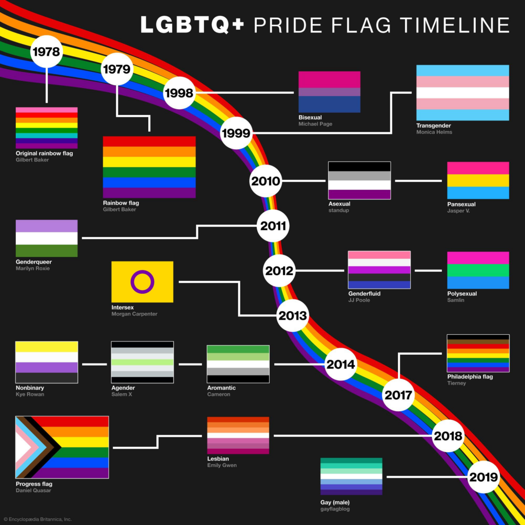
1978
Designer Gilbert Baker creates a new flag for San Francisco’s Gay Freedom Day parade. Based on the image of a rainbow — a longtime symbol of hope — the flag sports eight stacked stripes, each representing something different: pink (sex), red (life), orange (healing), yellow (sunlight), green (nature), turquoise (magic), indigo (serenity) and violet (spirit). Several months later, flags are produced without the pink stripe, due to low supplies of fabric in that color.
1979
The following year, a simplified six-stripe iteration debuts. The turquoise and indigo stripes are replaced by a single, more basic blue one. This is the pride flag that really takes off. It remains widely embraced, internationally, to this day.
1998
Activist Michael Page references the familiar rainbow motif with a new bisexual pride flag. A pink stripe represents same-sex attraction, and a blue one represents opposite-sex attraction. They intersect in the middle, creating a combined, purple stripe.
1999
Monica Helms, a Navy veteran and trans woman, introduces the transgender pride flag. It uses traditionally masculine and feminine shades of blue and pink, along with a central white stripe to represent people who are transitioning, those whose gender is neutral or undefined, and intersex individuals.
2017
The city of Philadelphia’s Office of LGBT Affairs director Amber Hikes teams with ad agency Tierney to unfurl a revised rainbow flag — now with added black and brown stripes to highlight and uplift people of color within the LGBTQ+ community.
2018
Nonbinary artist Daniel Quasar creates the Progress Pride flag. Overlaying the traditional six-stripe rainbow design is a horizontal chevron shape, anchored on the left and pointing rightward to express forward movement. This element features the black, brown, pink, blue and white stripes used in past pride flag variants, pulling in everything those colors were intended to represent. The black striping also recognizes people lost to HIV/AIDS.
2021
Valentino Vecchietti, founder of Intersex Equality Rights UK, modifies the Progress Pride flag to incorporate imagery from an intersex pride flag conceived in 2013 by Australian bioethicist Morgan Carpenter. A purple circle within a yellow triangle appears on the flag’s left side. The shape and colors were originally chosen by Carpenter to celebrate “wholeness” and avoid stereotypical gender associations.
Other variations have appeared throughout the years. Some versions have received mixed reactions — a testament to the breadth and diversity of the LGBTQ+ community. But there’s no denying the visibility and general meaning of the rainbow flag today. It’s an international symbol of love and respect. We’re proud to display it — and celebrate what it stands for.
For more about imagery that LGBTQ+ artists and activists have employed throughout history, check out Queer X Design by art historian Andy Campbell.
Related Posts

Shelter symbols explained
Have you noticed symbols popping up across our feed over the last few months? Curious about what they signify? When…
Read moreLocal artists Caitlin Lempia-Bradford and Daren Henry selected for Shelter winter studio art gallery
What is the Shelter studio art gallery? When we designed the new Shelter studio at International Market Square, we wanted…
Read moreThe Logo: Then & Now
"We asked for a new logo that did not completely erase our original logo, yet was not immediately seen as…
Read more